Tweetstorm: 21 Charts
| Crypto Words has moved! The project has migrated to a new domain. All future development will be at WORDS. | Go to WORDS |
Tweetstorm: 21 Charts
By Hans Hauge
Posted September 10, 2019
I’ve heard people say that being involved in Bitcoin is a game of speculation. Some say it’s all about FUD, FOMO, Fear and Greed or following the crowd. I call BS. Let’s look at the data! Here are 21 Bitcoin charts from @coinmetrics that tell a different story.
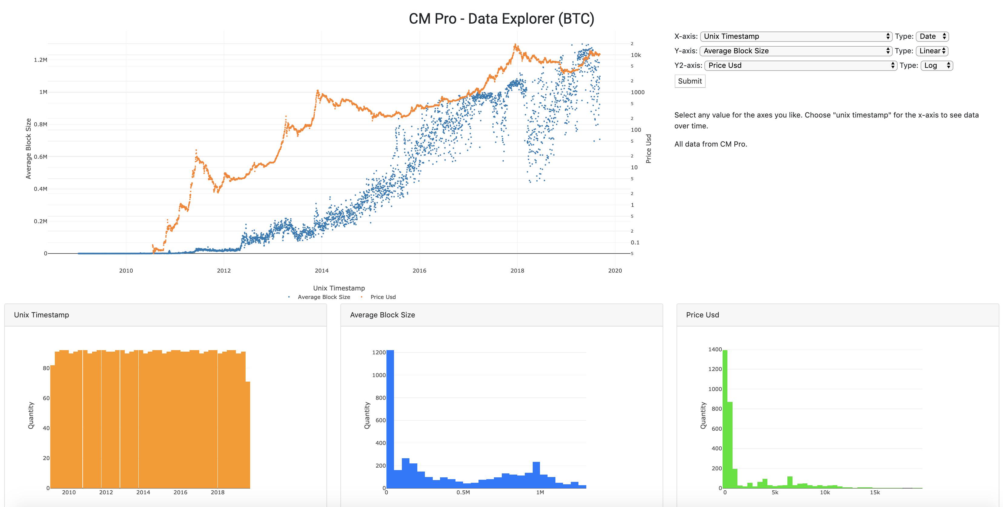
The amount of data being stored on the blockchain has been increasing constantly, regardless of the price. Why do people want to transmit data on the Bitcoin blockchain? It’s all about trust and the ability to transfer value without asking permission!
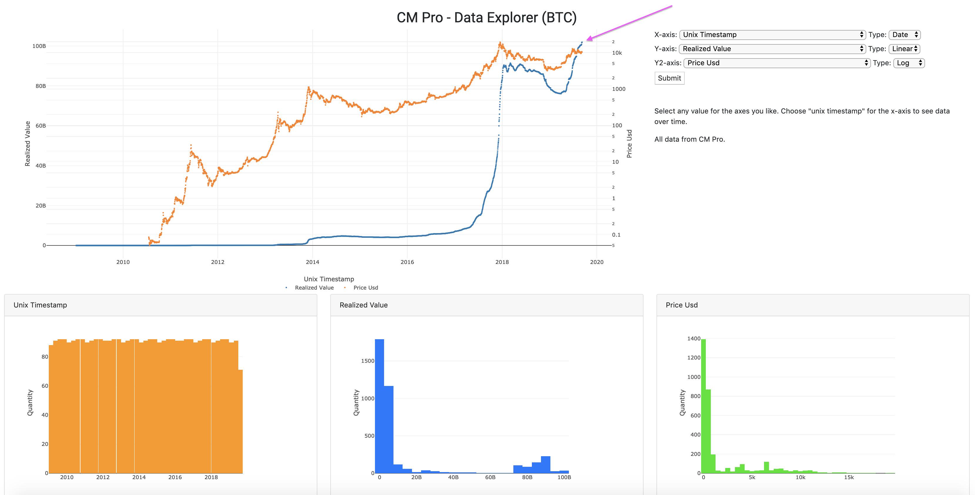
Realized value is at an all-time high. This is the amount the coins are worth the last time they were moved. Look at that momentum…
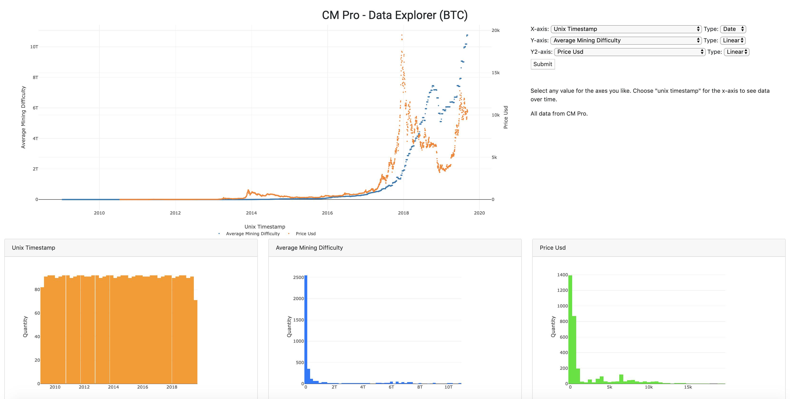
Look at the current mining difficulty. This represents an immense investment in infrastructure for the future of Bitcoin. Do the miners look worried to you? I estimate this represents at least a $10B investment in CAPEX and look at the growth…
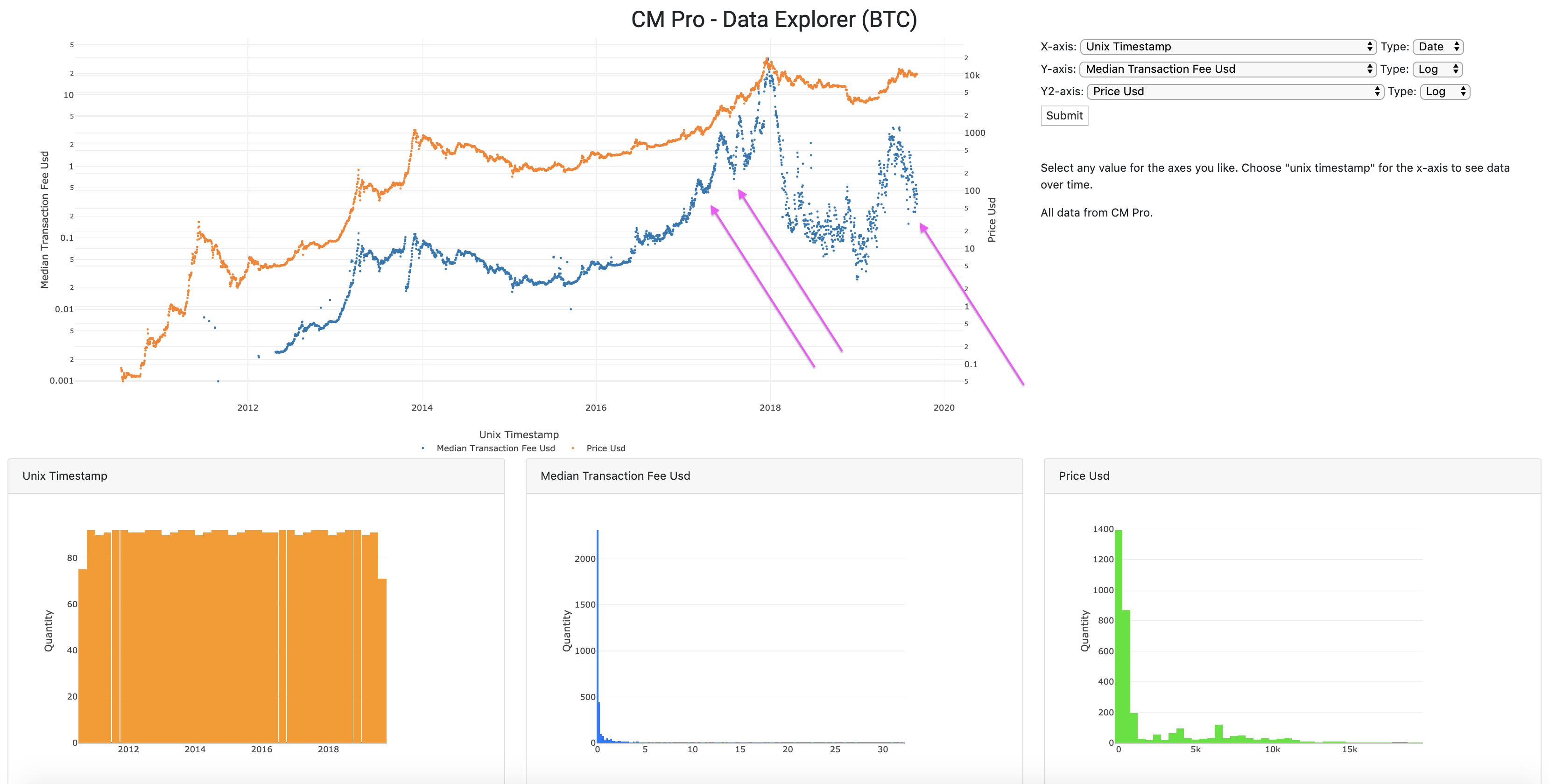
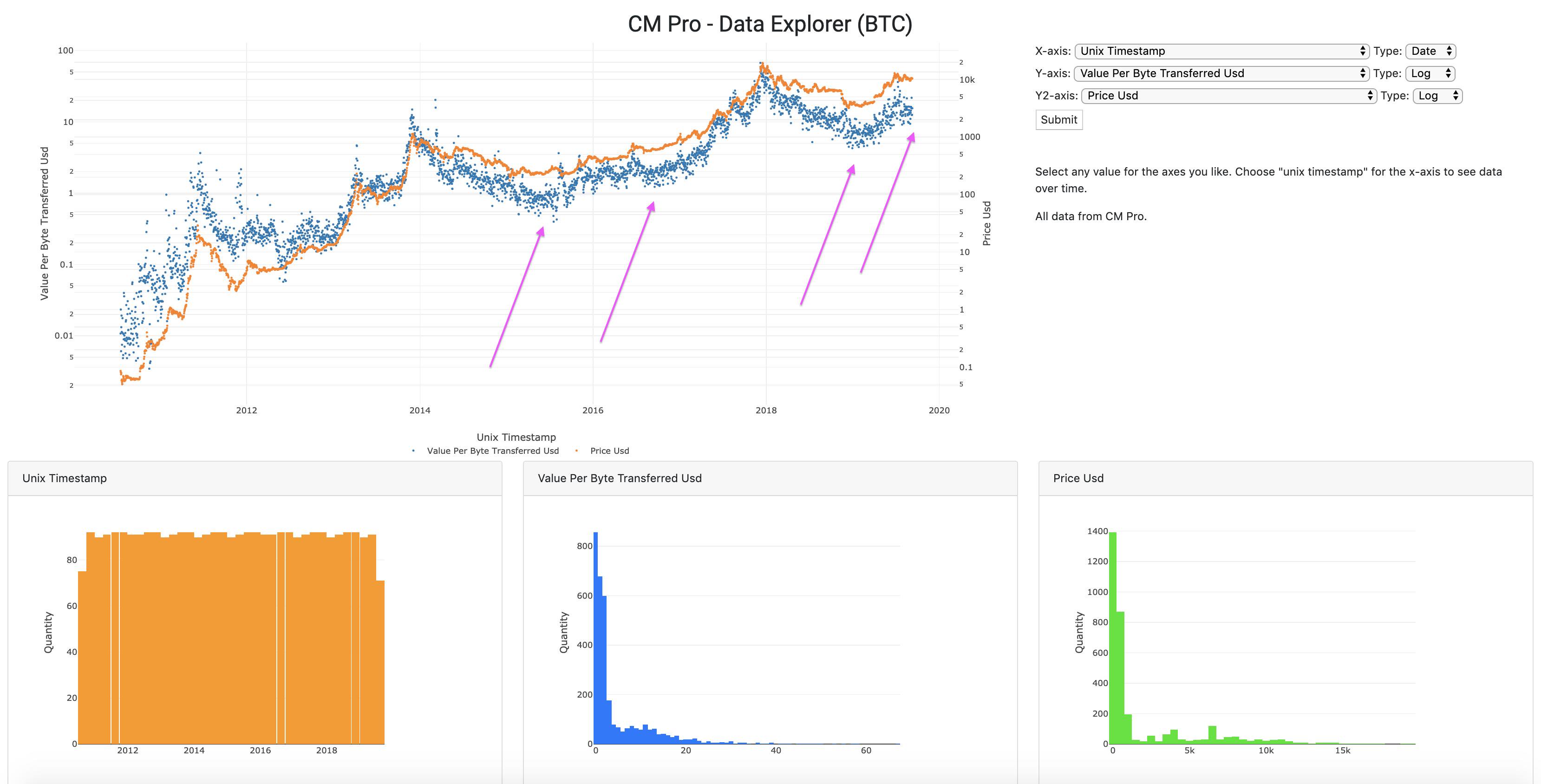
Check out the median transaction fee pull-back. The same thing happened in the last bubble. The price at those arrows on the left was $1k and $2.6k, which seemed high at the time. In retrospect, de nada.
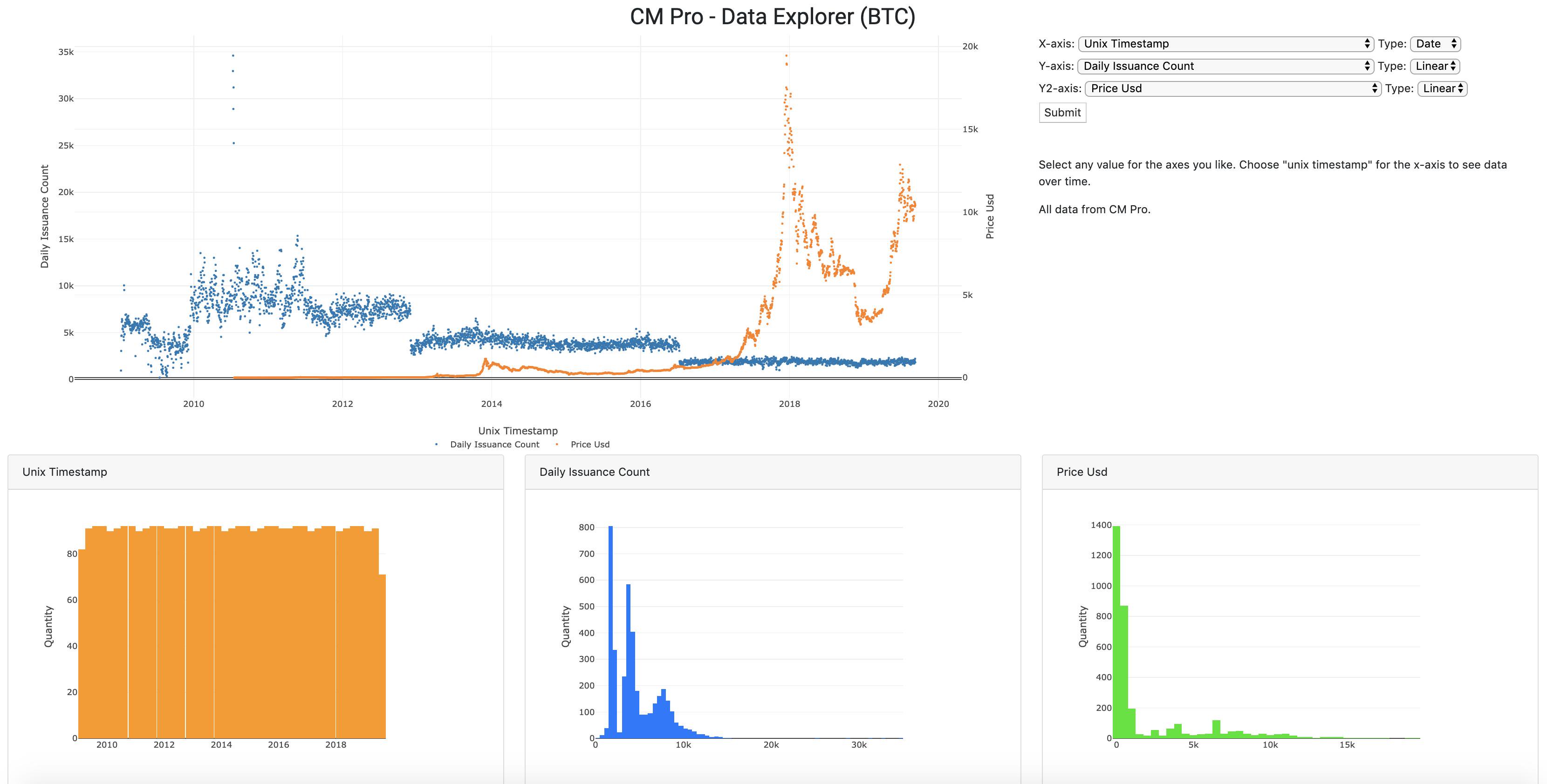
Daily issuance count, look at the decline. This reduction in new supply fuels one of the most basic laws of economics, which most commonly applies to commodities, Supply and Demand. If the supply gets squeezed and the demand keeps increasing, well…
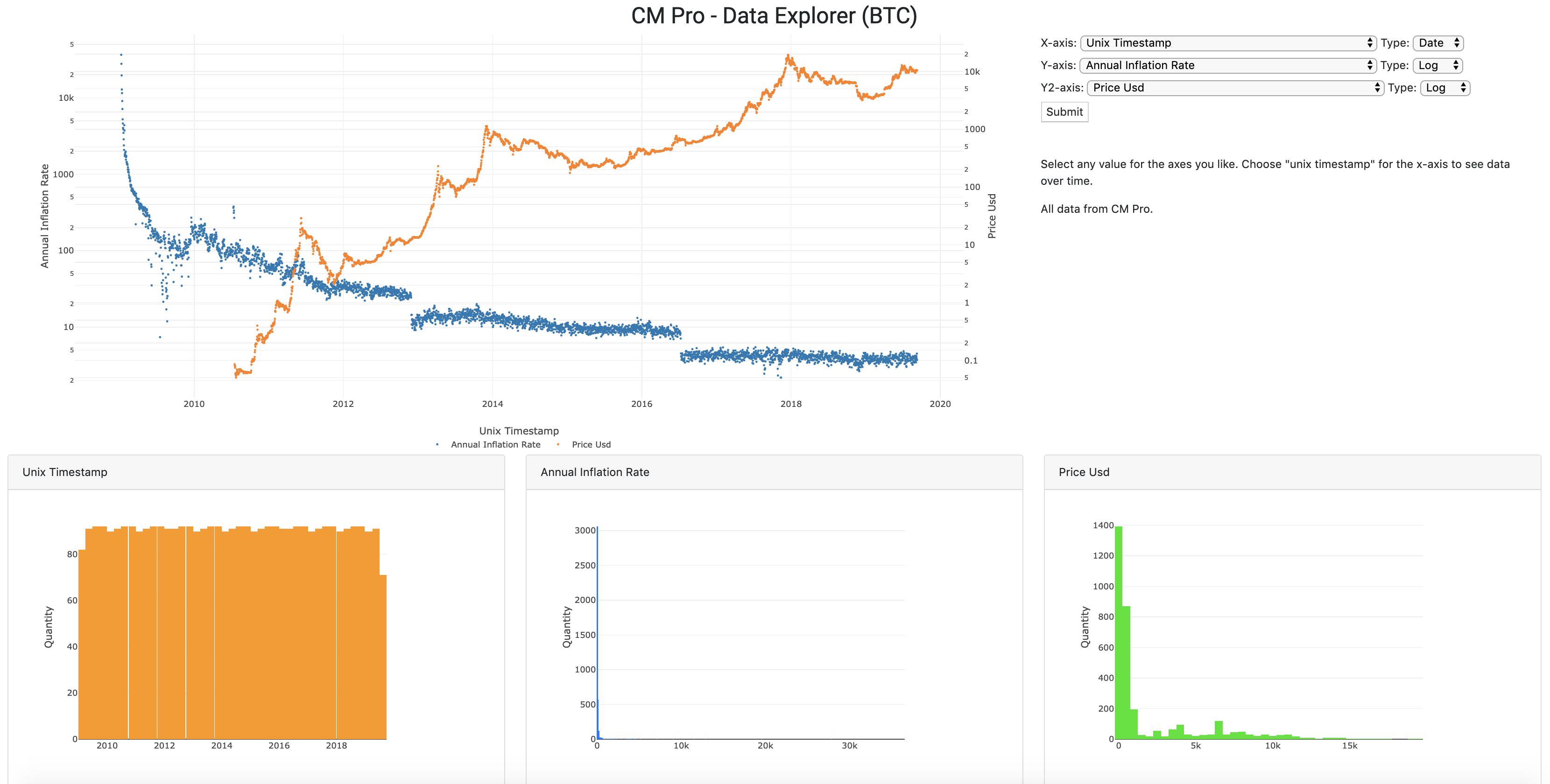
Here’s another view that takes into account the circulating supply. This is the Annual Inflation Rate. Who’s ready for the next halving?
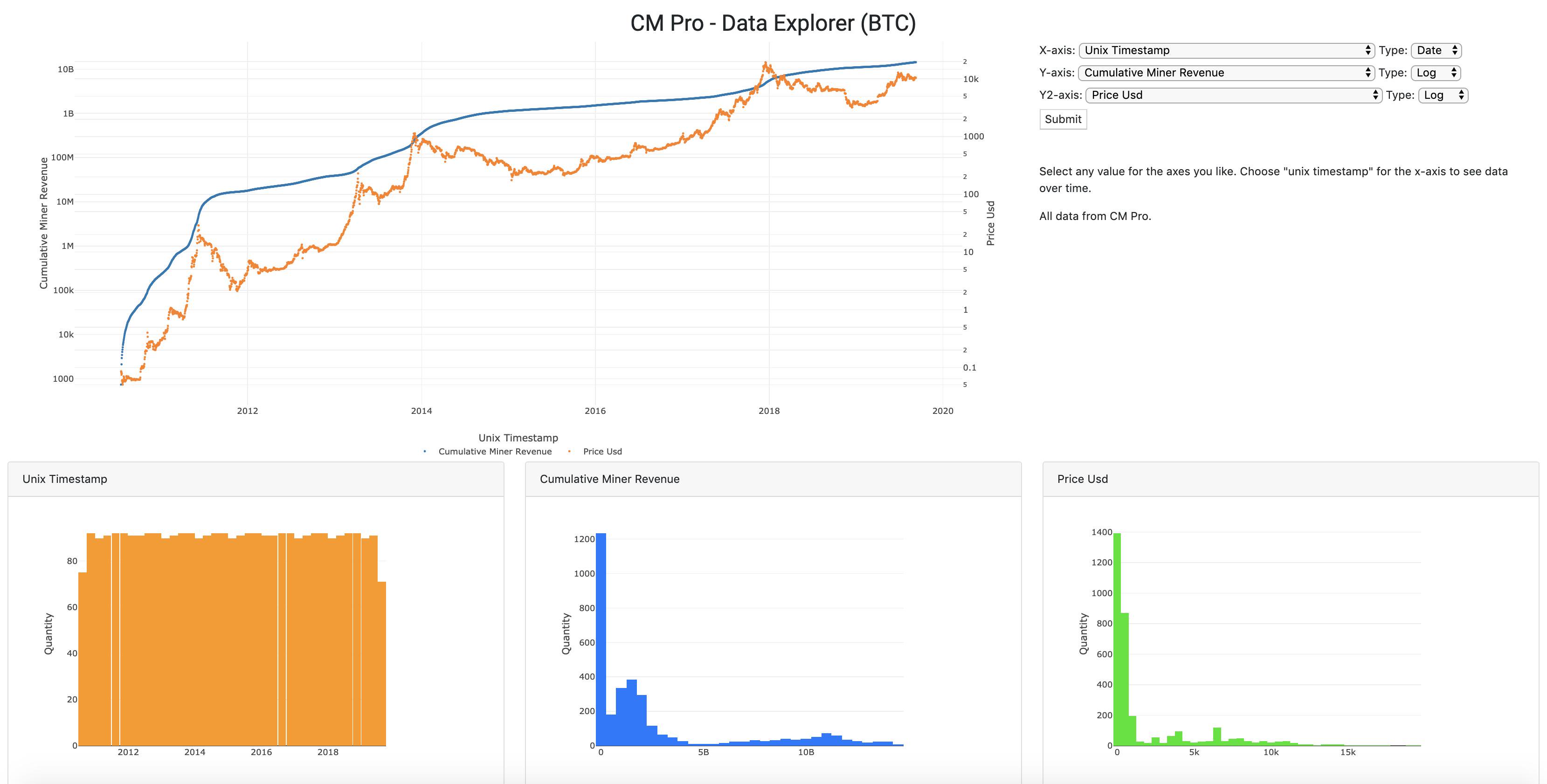
We talked about the miners earlier. What’s driving that increase in difficulty? If you answered “Revenue growth for the industry in Log(Log()) scale” you get a gold star!
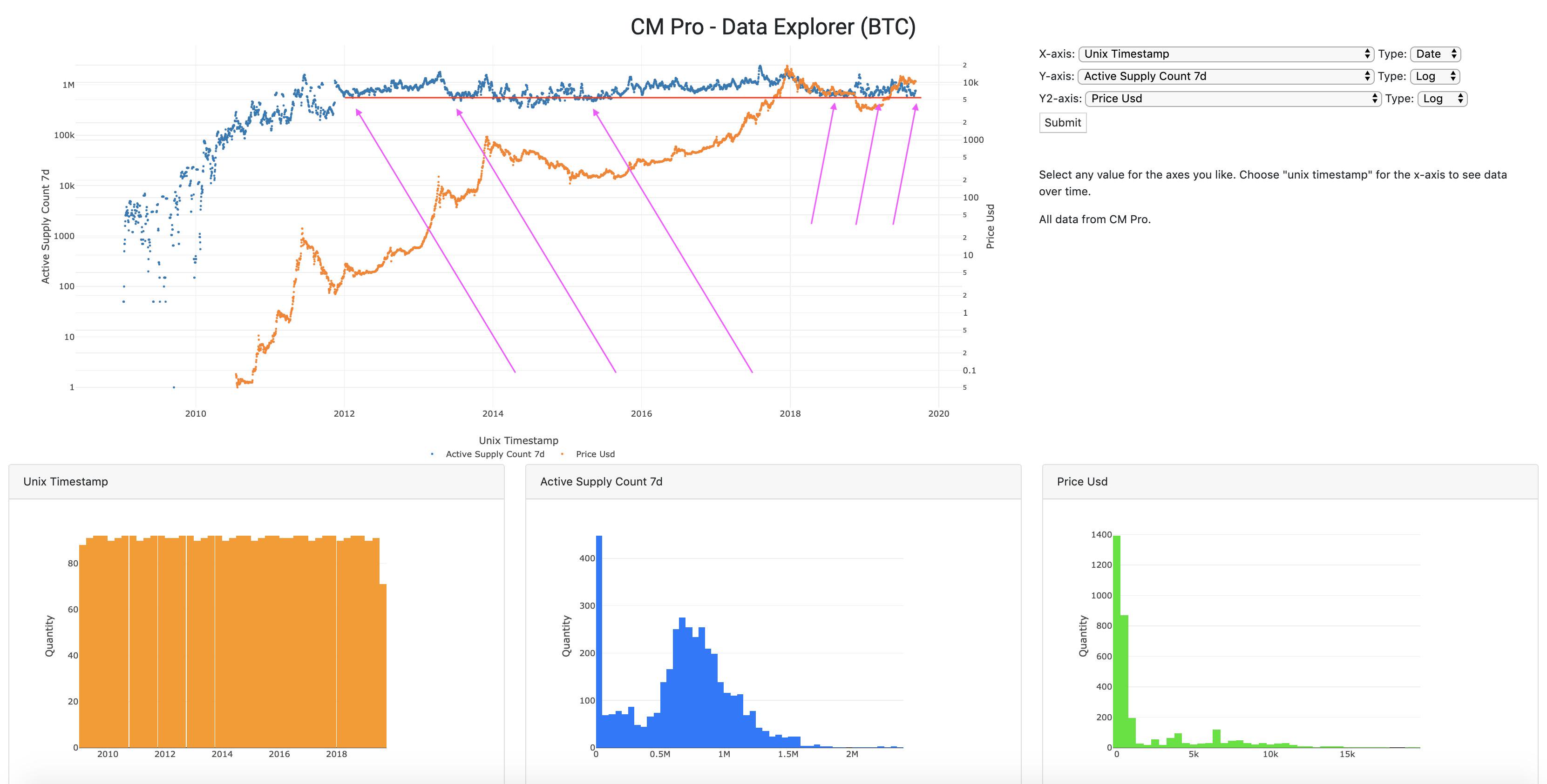
Let’s turn our attention to the active supply over the last seven days. This gives us unique insight into the behavior of Bitcoiners, specifically if they’re holding or trading. When the blue line touches the red line, there’s more HODLing going on, bullish in a bull market.
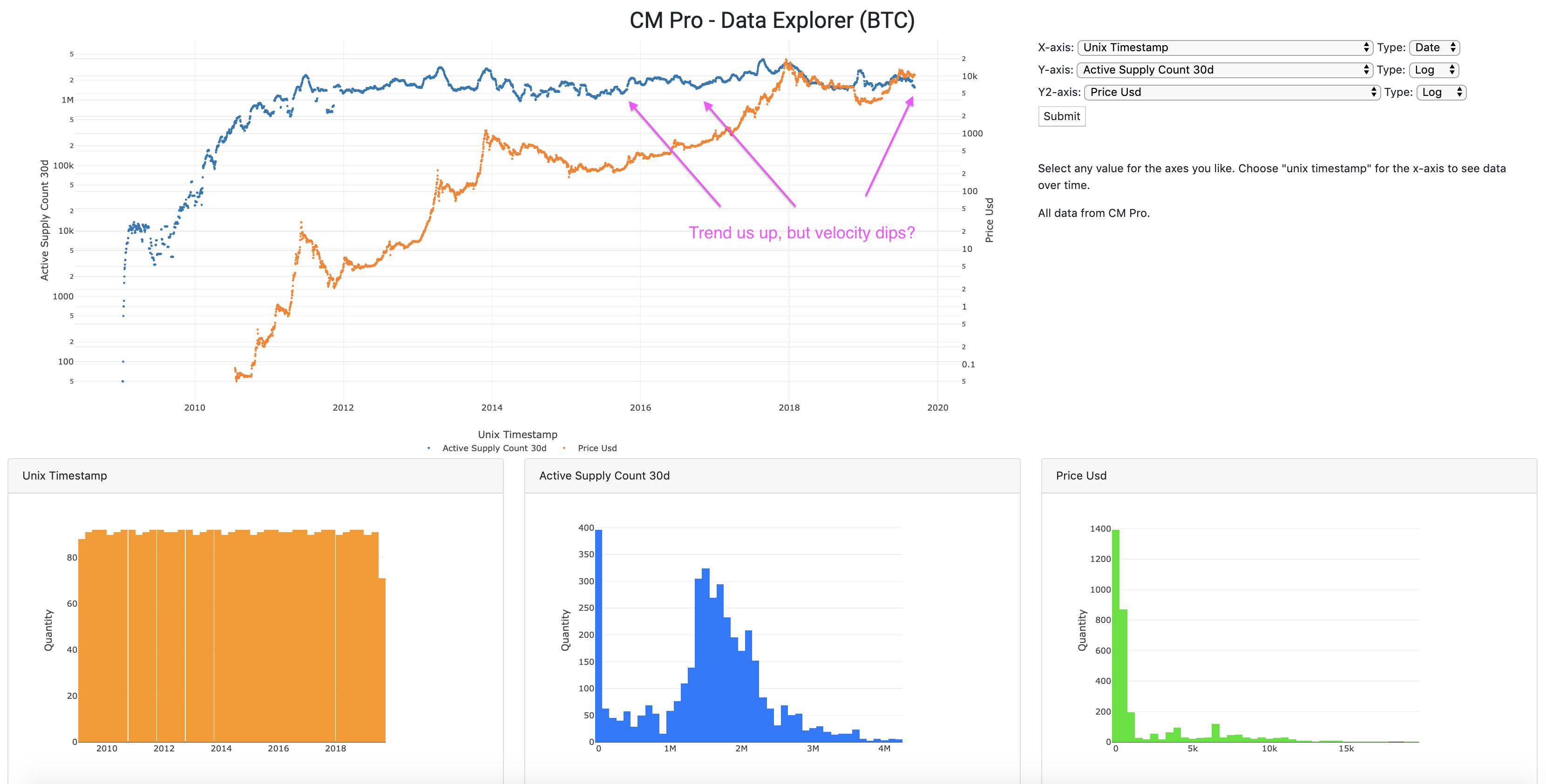
If we substitute the 30 day count for the 7 day, we get an even better picture. In the middle of a bull market, we see velocity drop. Why? This is the calm before the storm…
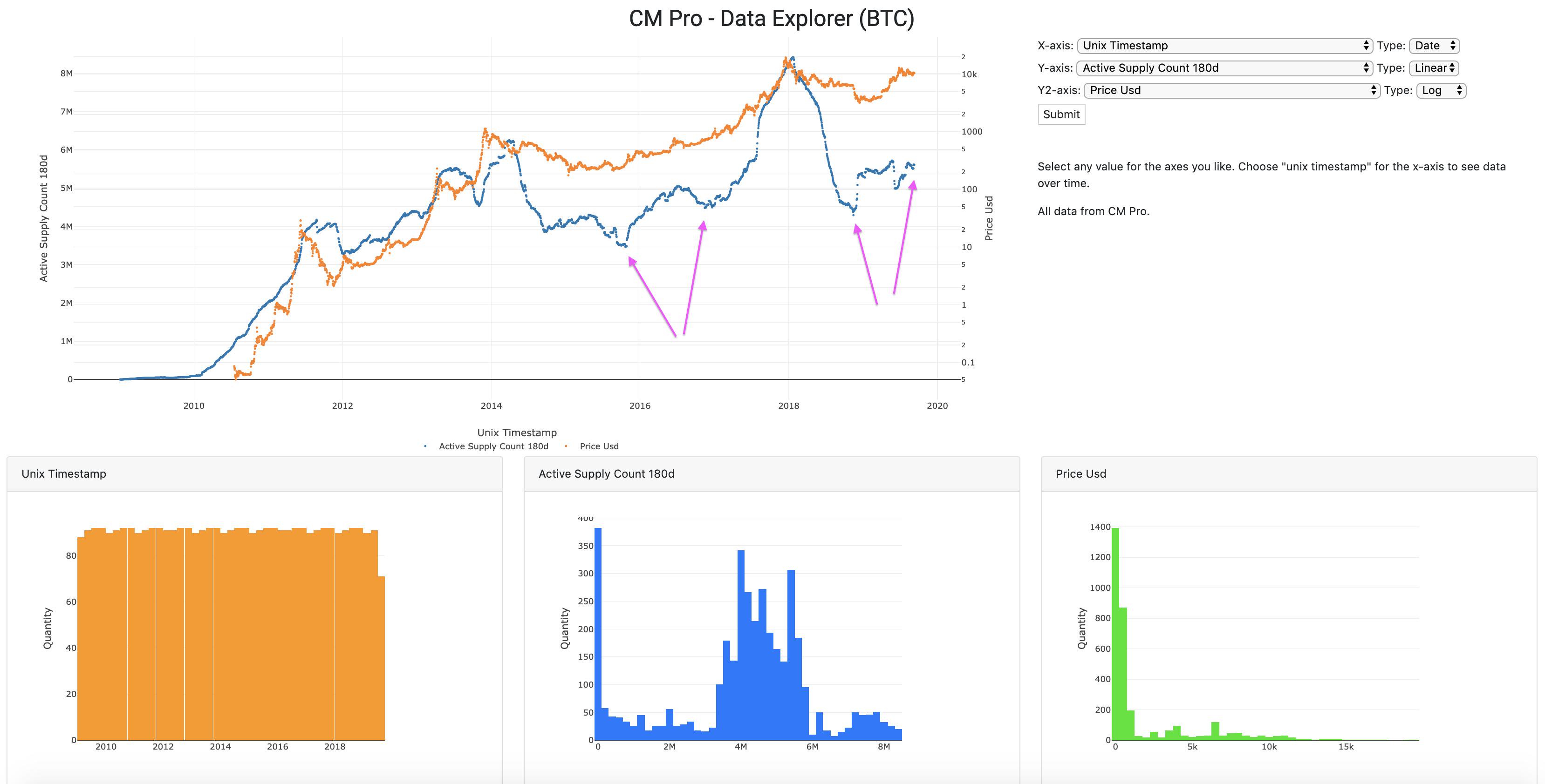
Now look at this, expanding to 180 days. One - Bottom of the cycle, Two - Second chance to buy in, Three - Moon. 2017 - the price in floor two fell from the $700 range to the $500 range; 2019 the price fell from about $14k to where we are now, near $10k. Same Bitcoin, 20x bigger.
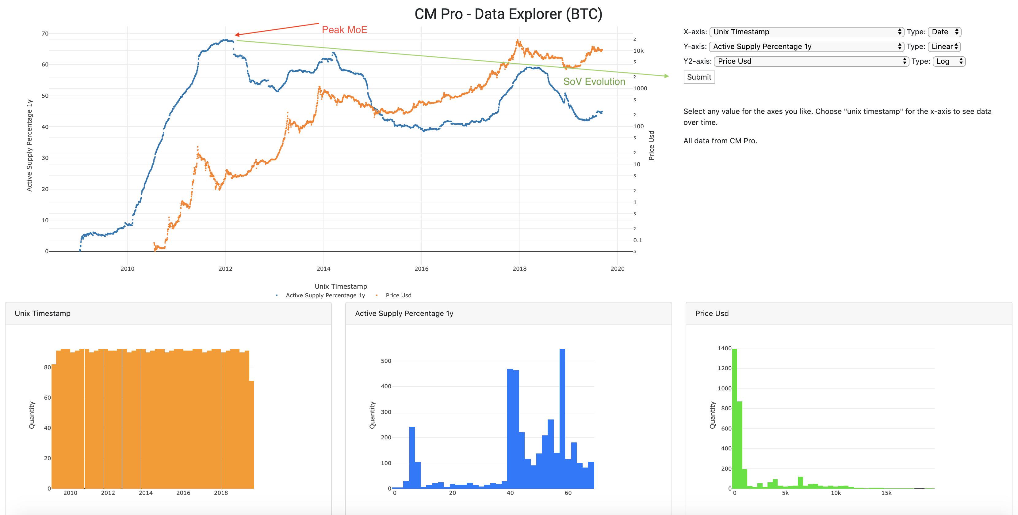
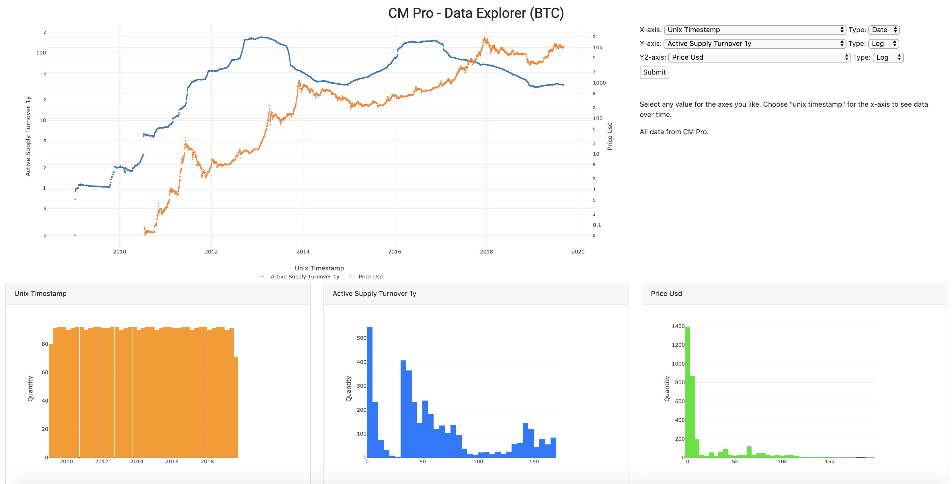
Waxing philosophical for a moment, I suggest Bitcoin is evolving from a Method of Exchange that can store value to a SoV that can be exchanged. As the market value increases, look at the change in the active supply percentage over the trailing 1y.
Coming back to the “two chances to enter” model for a moment, isn’t it a bit spooky how history looks like it’s repeating itself? Check out the value per byte transferred below. Got your ticket to the moon yet?
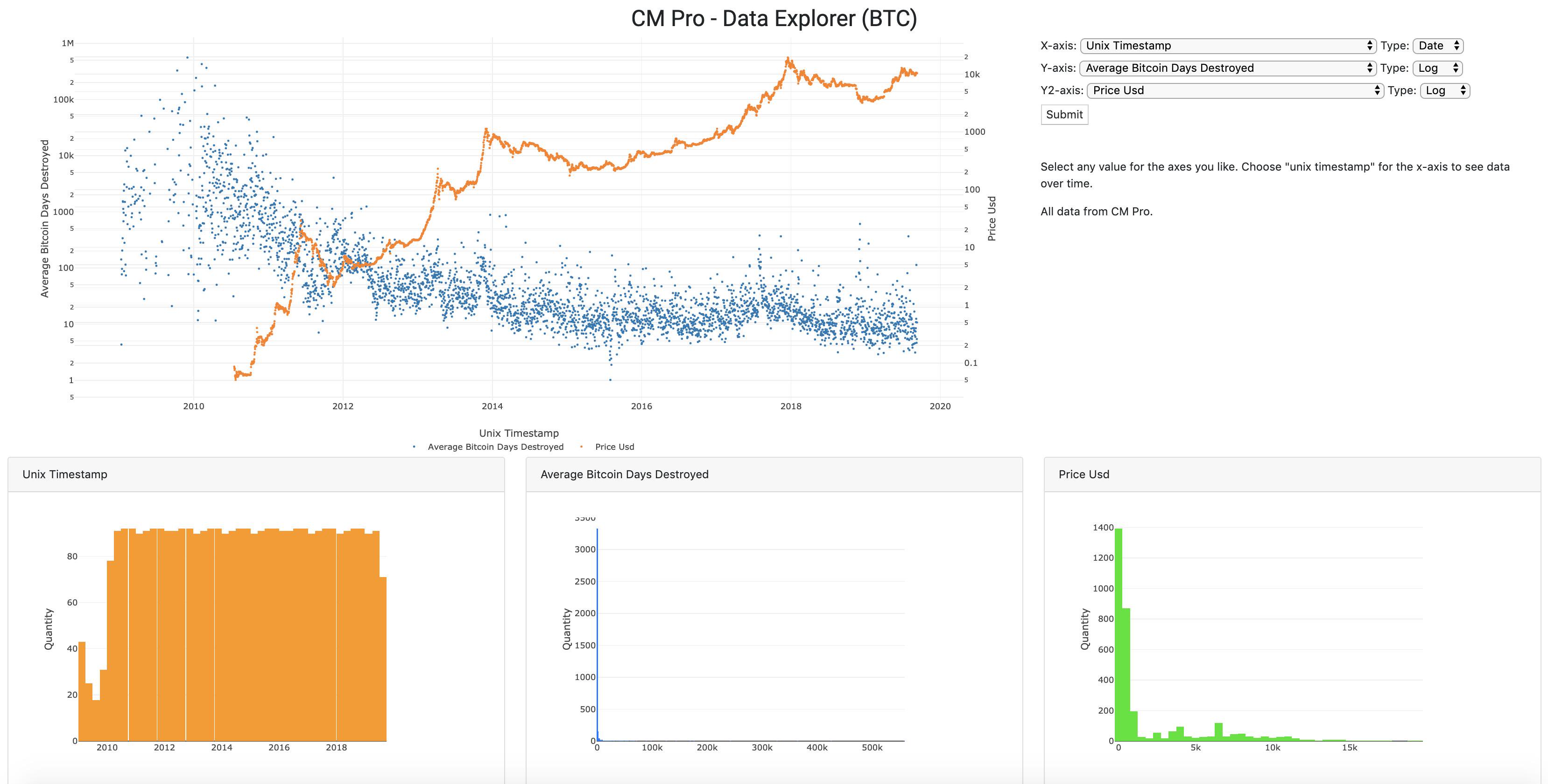
I normally talk about Bitcoin Days Destroyed in the sense of the TOTAL number or the adjusted figure (total / circulating supply). But, if we look at the average there is a constant decline. The longer you HOLD, the less you want to FODL paradoxically. Bitcoin Singularity?
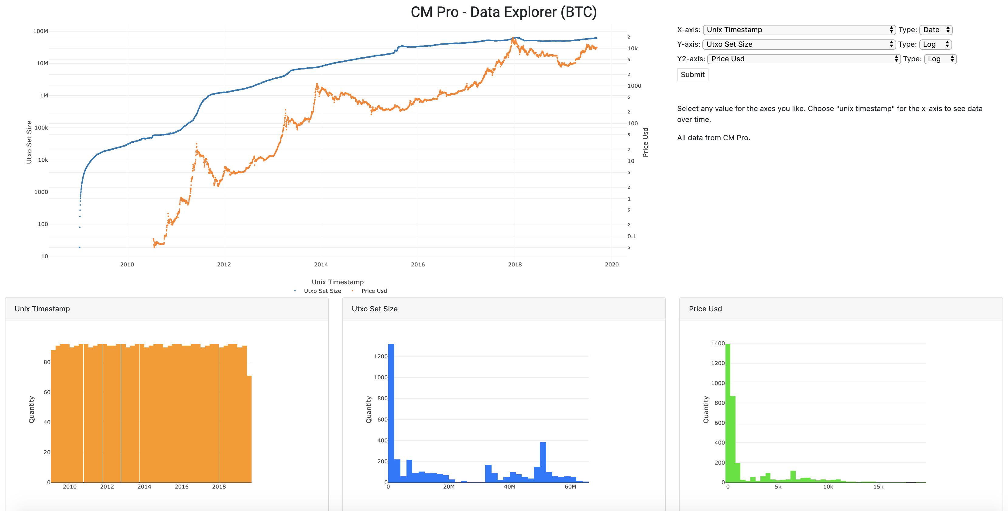
We talked about supply, now let’s look at demand using the UTXO set size as another way to conceptualize the participants in the Bitcoin network. Look at the growth here. This is getting very close to an all-time high as well.
In inventory management, turnover is a good thing because it shows you’re moving your product. But with Bitcoin, we have to consider that an increase in HODLing means Bitcoin is transitioning into a Store of Value as I mentioned before. Inventory turnover also supports this view.
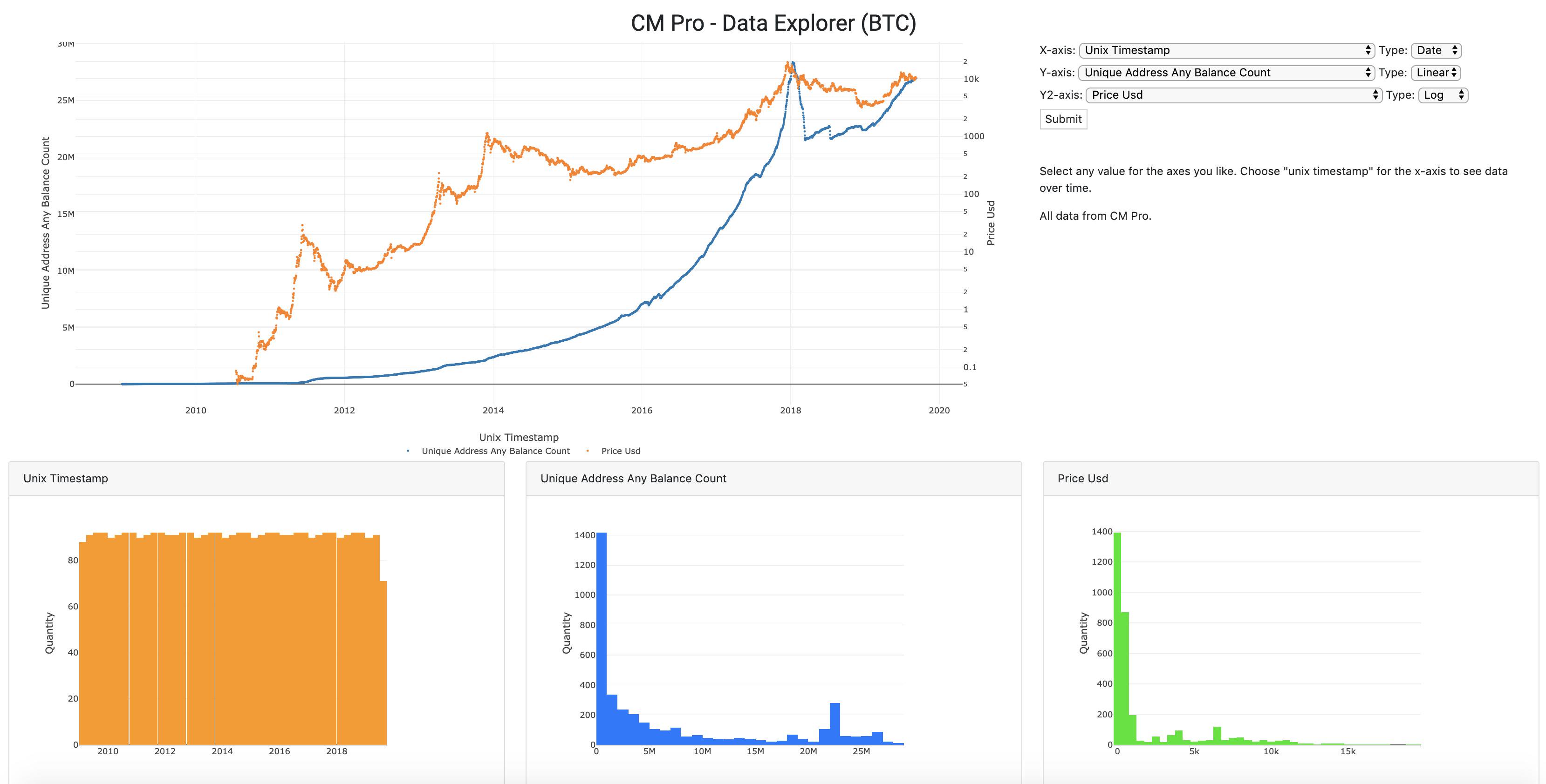
Back on the demand side again for you Econ nerds, we can also look at the number of unique addresses that hold ANY balance of Bitcoin. Also, this is near an ATH.
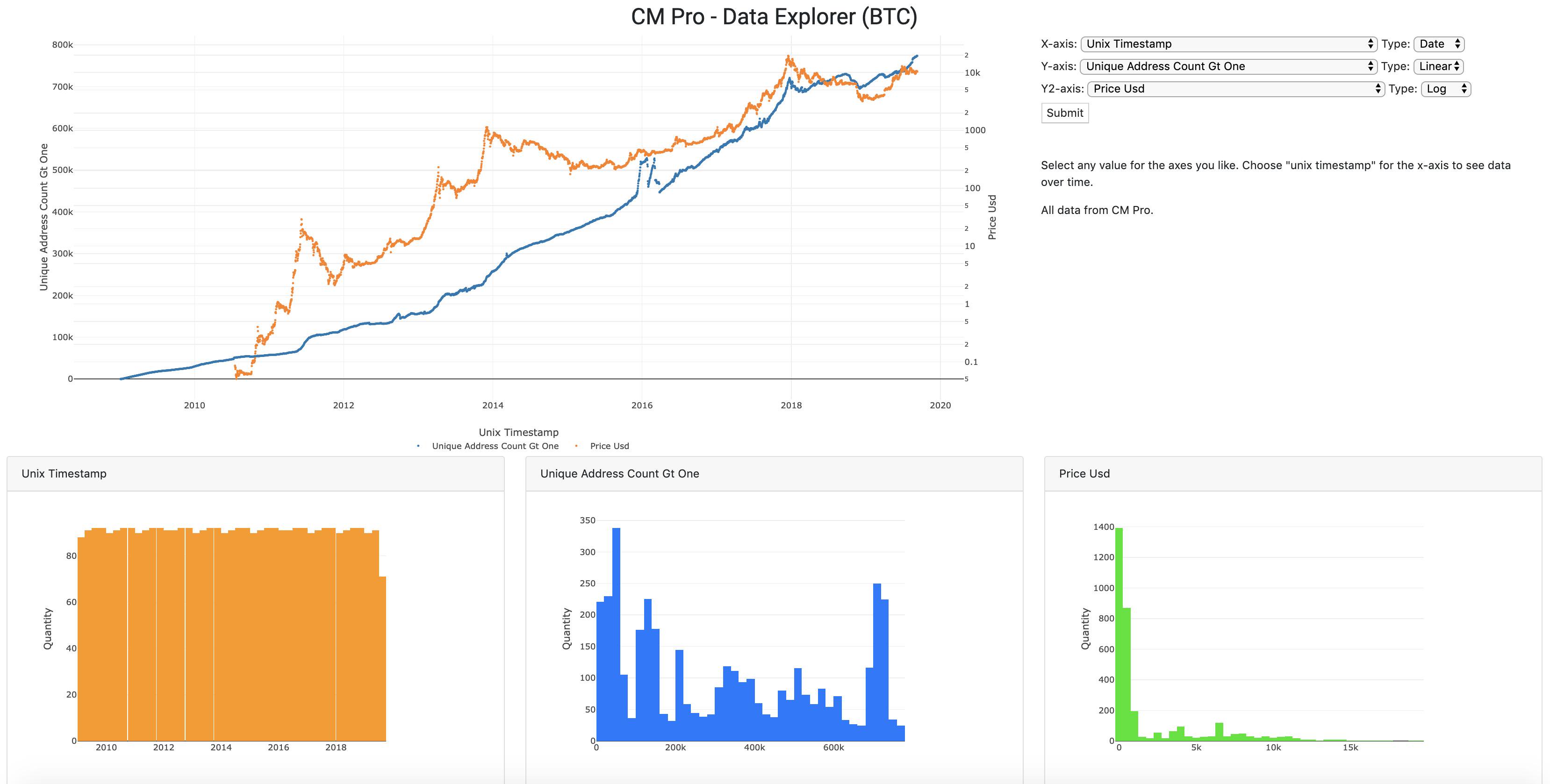
If we ask “How many addresses have at least 1 BTC” the answer would be in the blue line below. This figure IS at an all-time high (as of yesterday). The virus is spreading!
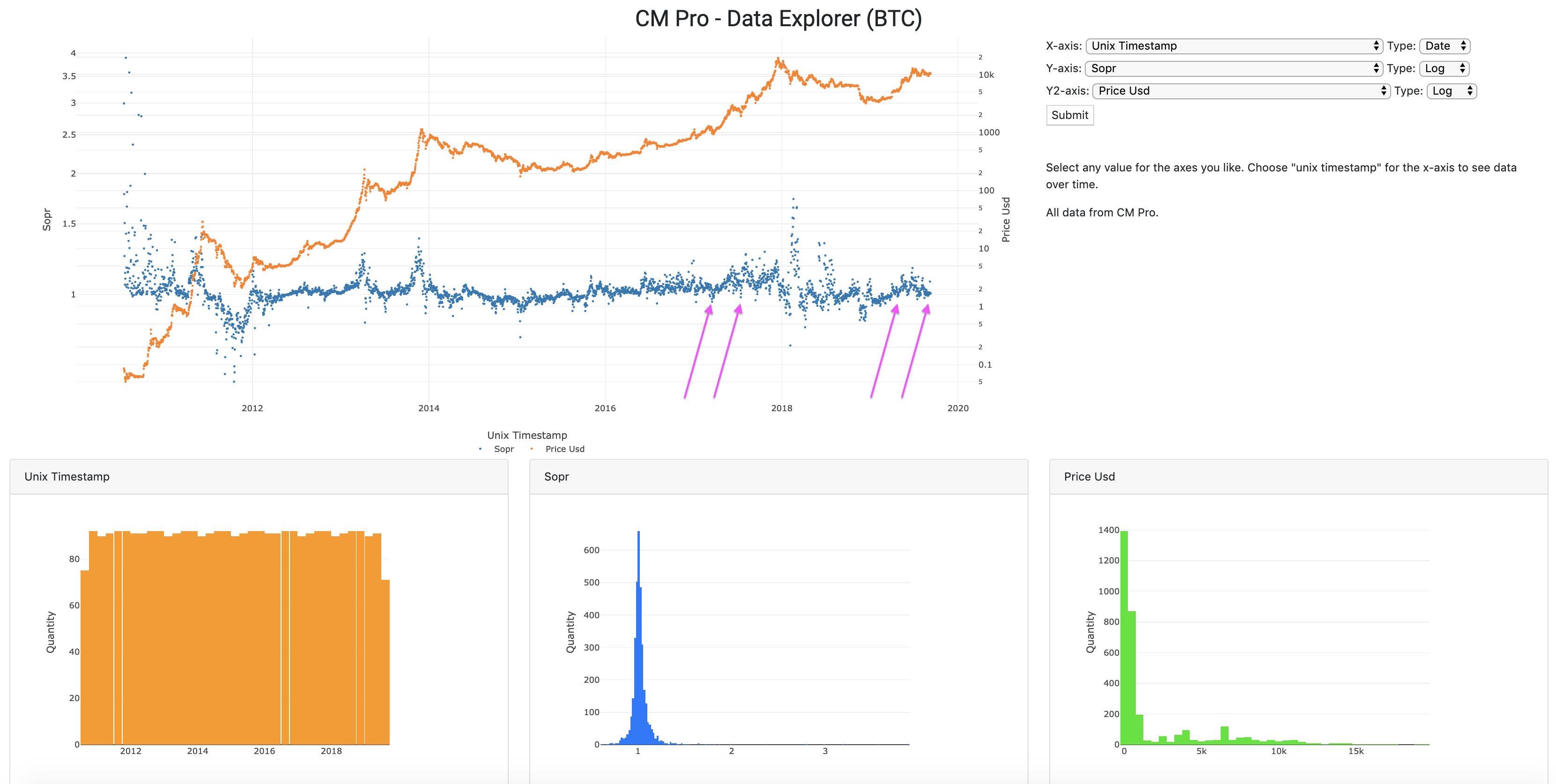
SOPR has reset to the “around 1” level. Last time we saw this the price was around $5k. Now we have SOPR around 1 at $10k. To me this speaks of the lower risk to entry. @renato_shira can correct me if I misunderstand.
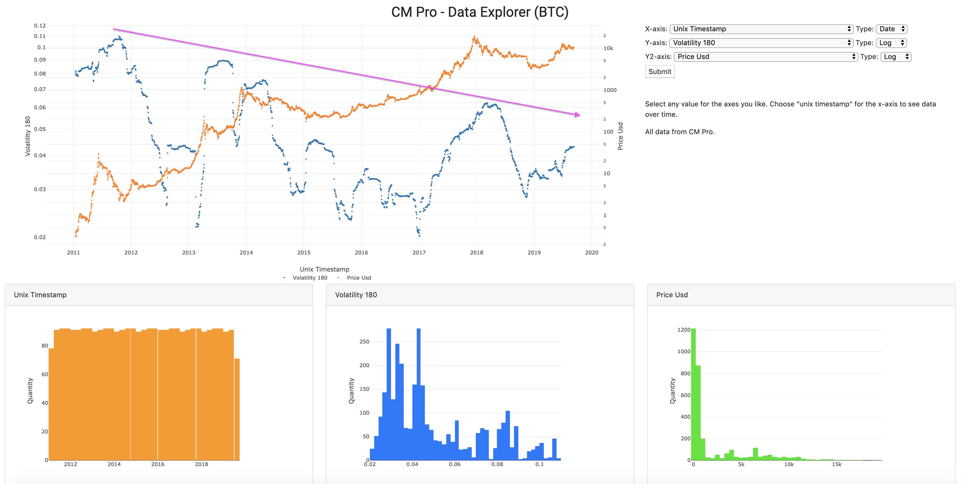
And of course volatility is decreasing over time in log scale. NBD. Majority of the volatility to the upside but let’s not mention that.
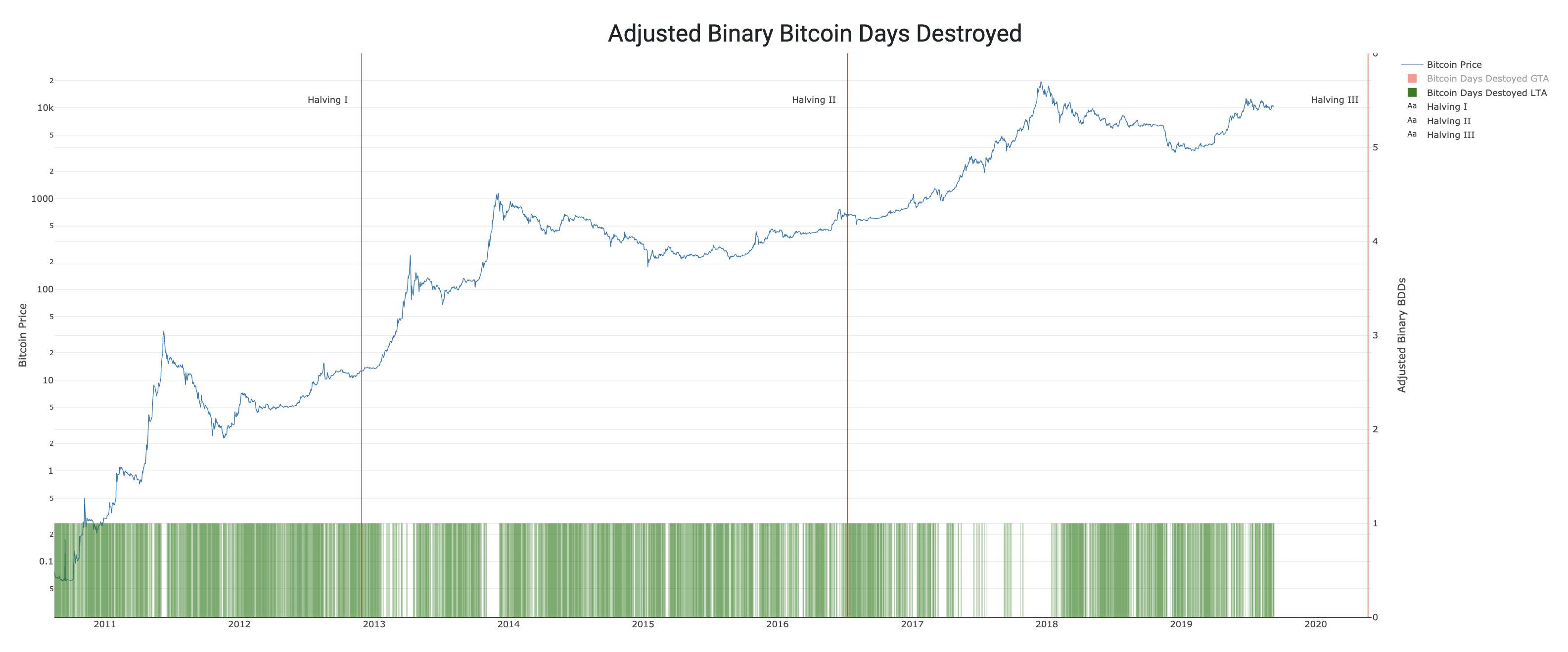
Another view of Bitcoin Days Destroyed, Adjusted Binary BDD. Green bars are LESS than average on an adjusted basis. Unless you see a white gap, we’re not at the top of a bubble. It’s just data.
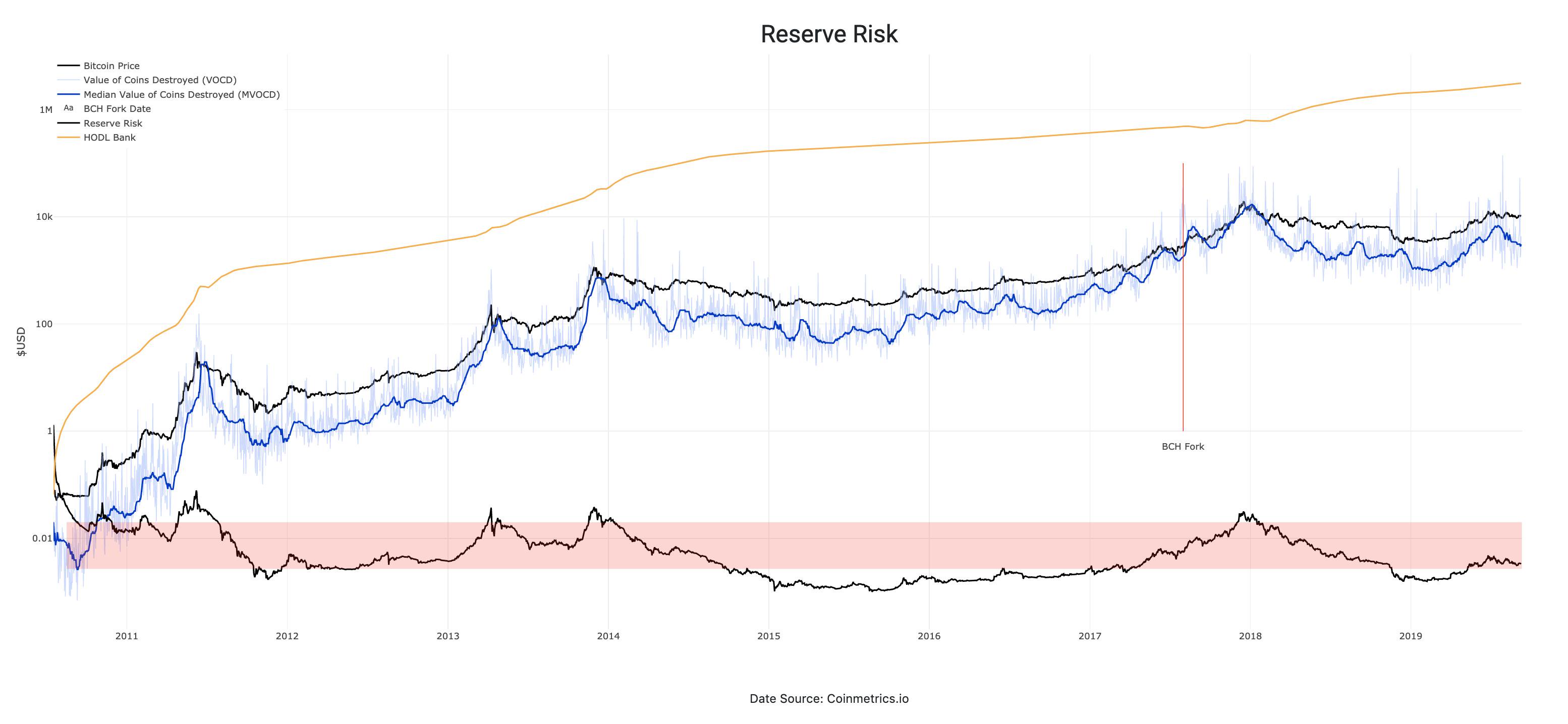
And lastly, Reserve Risk which answers the question “how much risk to I take on by entering now?” I rest my case.
